DLR GfR mbH in a brand new look
31.5.2020
Our new Corporate Design…
aims to convince. An 8-month process of strategy meetings, design coordination and many creative considerations lies behind us and we are proud to be able to present its results now.
A corporate design is a company’s fingerprint. It brings the identity of DLR GfR from the inside to the outside. They define the basics of a brand and create the basis for all forms of communication. A corporate design is aligned to all elements of this basis – it creates a strong and uniform impression in all media channels.
Precision.
Navigation.
Worldwide.
Our headlines consist of simple three-word structures, which use big keywords to express our attitude – clear, direct and precise. The solution-oriented and precise way of working at DLR GfR should be reflected in the entire corporate design – also in headlines.
The aim of the new visual identity is to consolidate DLR GfR’s position in the market as a trustworthy partner with a highly professional impact. All components of the new corporate design support this overall effect.
Navigating the Future.
Our new logo – “Less, but better.” is a famous quote by German designer Dieter Rams. A clear and precise brand does not need frills, but brings itself and its performance precisely to the point: the elementary components of earth, navigation and satellites form a strong figurative mark with high memorability.
Design and Colors
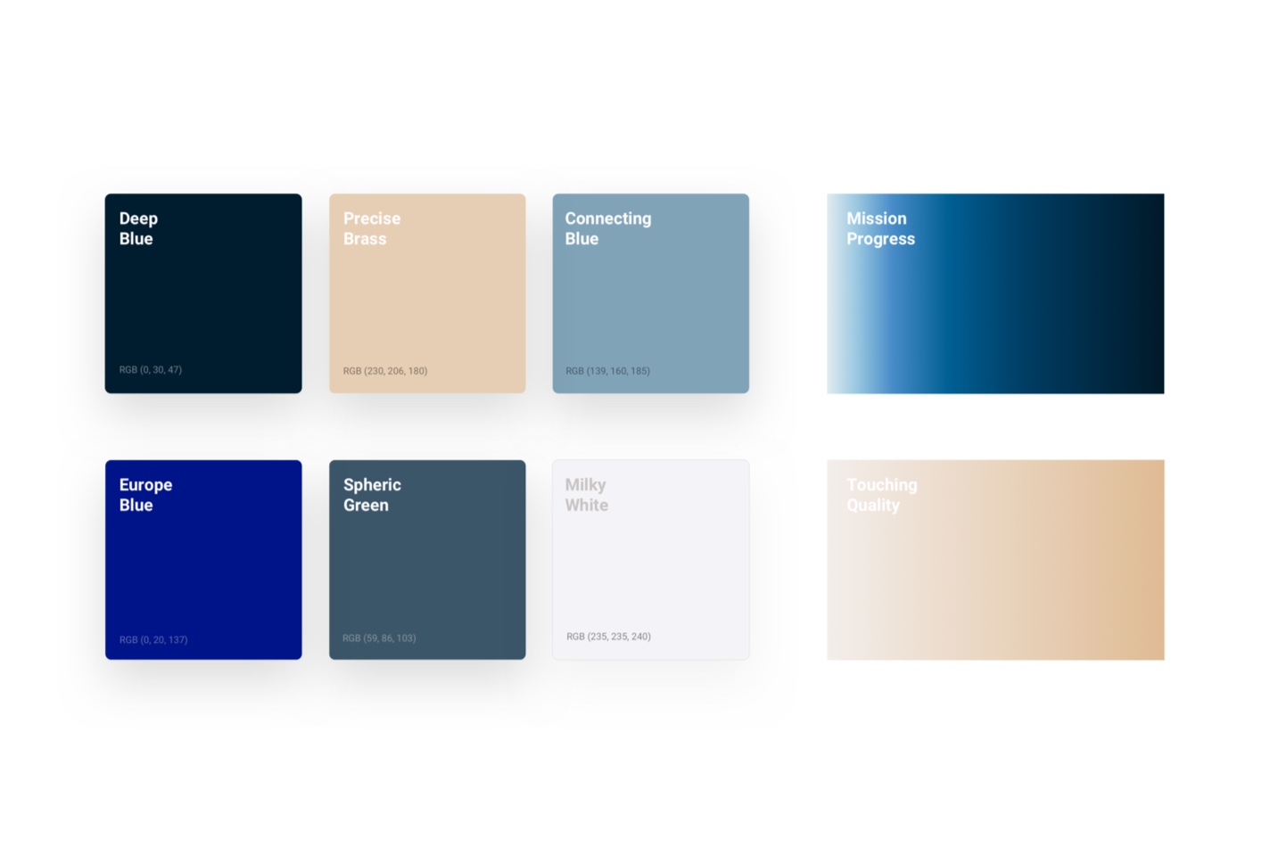
The colors of DLR GfR are derived from the brand’s core values and use the elements of space travel and modern technologies, as well as of community internally and externally. The corporate design combines all components of the brand – logo, colors, font, style elements – and thereby creates the unmistakable fingerprint of the new DLR GfR brand.
We are convinced that with our new look and feel we will be able to communicate the competence and extraordinary commitment of our valued employees in an appropriate and appealing way.